Osaka World Expo ideas that are worth are worth stealing for your sales office.
Excuse me while I revel in my smugness of attending the Osaka World Expo pre-summer swelter. I managed to leg it round (and round) the site in Springtime before the sweatiness and stickiness set in. I’m seeing images and complaints of attendees having their faces melt in the snaking queues to enter pavilions, and I think it’s best to share what I saw at Osaka World Expo, which is sales office-worthy, lest you be tempted to jump on a plane and join the teeming throng topping 150,000 visitors a day.
Let’s roll! Here are the five things I saw at the Osaka World Expo that are worth applying to your next sales office:
- THINK BEYOND THE BOX
The majority of sales offices are boxes. And of course, they are – it’s the most cost-effective shape to build and transport. However, don’t let the ease of construction deter you. Many things – like architectural features, intriguing finishes and integrated signage can turn the most basic box into a designer marvel.
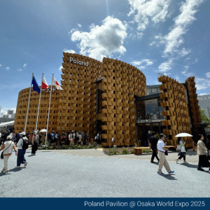
Take the Poland Pavilion, a simple glass box clad in cross-sections of plywood that encircled its exterior.
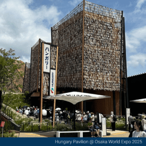
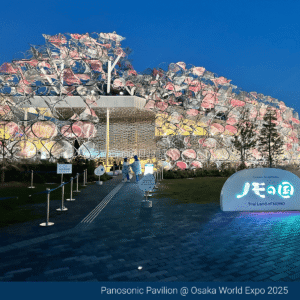
Hungary and the Panasonic Pavilion went with an exterior that featured fabric that shimmied in the breeze and shone under the sun. I stood transfixed, watching these pavilions transform before my eyes, and the wind ebbed and flowed. Wouldn’t it be a ball-tearer to see a sales office with a kinetic element incorporated into its facade?
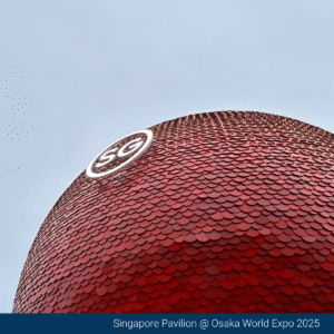
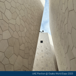
Over at the Singapore Pavilion, the domed structure was clad in a multitude of different red-hued scales. The UAE-intertwined pavilion exterior consisted of interlocking, concrete-coloured shapes. It was a refreshing change from the standard timber-clad exteriors we’ve seen frequently in the sales office space.
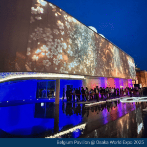
Belgium decided to turn its facade into a super-charged AV screen with a stretched white canvas providing the backdrop for continuously changing images, animations and projections. It provided a great distraction from the queue to enter the pavilion (20 minutes, which is pretty tidy considering some wait times to the Japan Pavilion were three-plus hours).
2. A PICTURE TELLS MORE THAN A THOUSAND WORDS
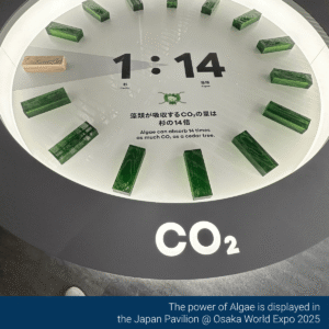
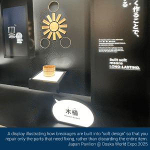
No surprise. The Japanese Pavilion lived up to its home ground advantage and nailed the “Designing Future Society for Our Lives” Expo Theme. Big ideas, such as using algae as a power source, mould-eating plastics, and deliberately designed failure into objects, were all presented with clever clarity.
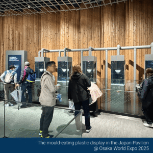
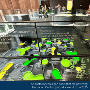
Using simple graphics, a restricted colour palette punctuated only by green highlights and LED lighting, these complex concepts were easily understood by both young and old. It was fascinating to watch people linger in the displays and not scamper through, trying to get the vital pavilion passport stamp.
The takeaway for sales offices is to prioritise imagery, illustrations, and animations over large blocks of text that will likely go unread.
I remember a property developer from years ago insisting that they MUST have a timeline of the developer in their sales offices. It was a bone-dry display that drew absolutely zero attention from visitors. It was a waste of good real estate that would have better landed with customers about why this development was the first choice for home buyers over the other competitor estates. No one cares about some CEO that kicked off the company some 40 years ago when you’re wanting to buy your dream home you have worked two jobs to save for.
3. SWING BIG
One of the most coveted pavilions for entry was the Sumitomo. As soon as bookings opened up, the available slots disappeared. But on my last day, I got lucky and snagged a coveted slot.
Availability was heavily restricted because groups navigated the darkened, immersive space, with 40 people at a time, armed with a lantern that contained an embedded NFC token, which told the story of the forest. As you moved through key areas, your lantern triggered stories of the flora and fauna that make the forest its home.
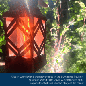
Large projections of stampeding animals were paired with more secret screens showing animations of a wolf family hidden in a forest grove. To shepherd you out of the space, a “storm” broke in the forest, and we all headed for the cover of the next immersion, freeing up the space for the next group.
There was plenty of disappointment among the Expo-goers who were unable to secure a space, and I felt super lucky to have experienced such an audacious and thoughtful pavilion.
In sales offices, I see a lot of scope for including more “Wow” elements to delight and intrigue your customers. I don’t think safe sales offices are the answer in this era, where marketers must compete increasingly for the attention of consumers. Sometimes, you have to risk it for the biscuit.
4. TELL ME A STORY
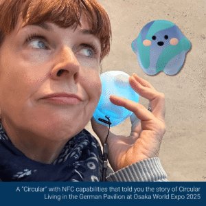
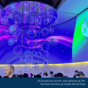
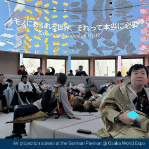
Time for a storytelling masterclass that comes to us from the German Pavilion! Holy cats, Germany turned it on once again. They have consistently been my MVP since my first World Expo in Shanghai in 2010. At Osaka, they went beyond the Expo Theme of Future Living and talked about the good stuff those savvy Germans are doing now. There was an absolute shedload of interesting information and facts about better living practices, but it never felt overwhelming or laborious.
First up, you received a cute talking “Circular” that chattered happily away to you when you activated it through the Near Field Communication points. Crowd control was via a curved ramp into the main pavilion, and your wait times were made interesting through large-scale graphics showcasing Germany’s initiatives in Circular Living like Hanover’s first recycled house, where carpets were made from old fishing nets or old abandoned buildings in Mecklenburg being repurposed as artist and co-working spaces to support the local small business and creative industries.
The German Pavilion uses a lot of tech, but it leads with the story, not “Hey, we’ve got this cool curved projection screen, what should we put in it?” There are plenty of opportunities to slow down and absorb the story; you don’t feel like you’re being bum-rushed through the pavilion, so the foot traffic count stays up. This is a good takeaway for sales office design – do you have enough spaces allocated for lingering and conversations?
Towards the end of the exhibition, it was time to get all handsy and interact with the displays. You could spin a fabric wheel and then, using mirror technology, the recycled fabric you picked on the wheel would then show you clad in the latest far-shun. (I looked awesome in triple denim!)
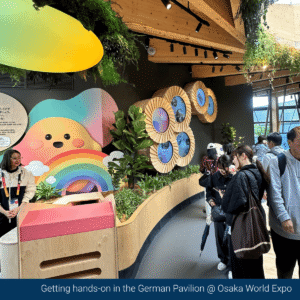
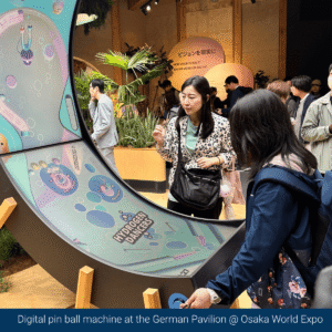
We know that people retain more information (up to 50% more) if more than one sense is engaged, and it surprises me that sales offices can still tend towards a passive approach. It’s no secret that customers love finishes boards, and that’s because they engage the sense of touch. Being able to run your fingers over the plush carpet, the luxurious stone, or the timber texture becomes those emotional touch points, allowing customers to start seeing themselves in their new home. Some of our clients are beginning to explore moving beyond a passive display and engaging more of the senses, and I’m here for it!
https://virtual.expo2025germany.de
5. HANG YOUR HEAD IN SHAME (A CAUTIONARY TALE)
In past World Expos, the Italian Pavilions have been a standout. However, in Osaka, Italy lost its design mojo. Outside, the pavilion was damn ordinary, and it didn’t improve inside. I managed to score a pre-booking, so I bypassed a lot of confused people trying to work out if the 2-hour wait was worth it or if it was best to call time and join the gelato queue instead (hot tip: gelato was the better choice even at $12 a scoop).
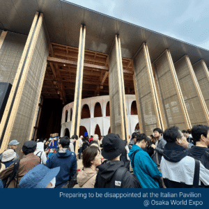
Inside the pavilion, you moved through a series of random displays. Here’s a replica of the “Statue of David” statue. Aaaand over here is Boccioni, “Unique Forms of Continuity in Space”. There was a whole stack of competing, distracting AV screens that showed videos of road construction and indistinct tech.
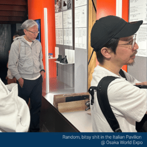
The criminal part was that the pavilion design forced all confused and bemused attendees into a lift that held 12 people AT A TIME to exit the bottom layer of the exhibit to be then booted out onto the roof of the pavilion that had an unoffensive but unexplained planted meadow. The final inglorious act was to then exit the pavilion entirely via a set of stairs and past the $12 Gelato stand.
The cautionary tale here for the sales office is not to rest on past successes or reputation. You need to keep innovating and provide a customer-centric experience; otherwise, you will be left behind by other, more nimble and hungry competitors that want to create a standout experience for their customers. I mean, Italy…c’mon. There is SO much good stuff you could have highlighted; instead, we got a display made up of items left out for council pickup and a squeezebox lift to nowhere.
